

I have been gone for a long time. Other things have occupied my time, namely, creating paintings. One of the reasons for this art analysis blog was for me to idnetify things that I found appealing in works of art, analyze them and see how I might be able to incorporate them into my own work. Well, in order to do that you have to work on your own work. In doing so, I have identified a number of shortcomings in my technique, in my process and in my understanding of the principles of color, light, gesture, brushwork, etc.
This has prompted me to start this analysis project again with a more directed focus. I will be looking at drawings and paintings from an artist that really respect and admire, Petar Meseldzija for the next few posts (perhaps more than a few).
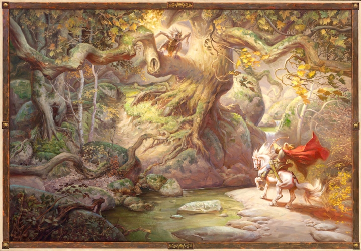
I have been looking at this painting all day. It is not the full painting, but the version is very good quality and enabled me to look at a number of things. The first thing that jumps out at me is the brushwork. This painting is just full of loosely placed strokes from the contouring cool raw umbery ones in the river bed to the short, unblended ones that wrap around the tree trunk. In each case as well as the majority of the remaining strokes, they are used to not only apply color to location on the picture plane, but they are used to define the form. WOuld the tree branches look round based on the color and lighting, even if the strokes weren’t there? I would suspect yes. However, the brush strokes make them “feel” round, as if you can imaging taking your finger and follow the contour of those branches.
The next thing that I have identified that I don’t exactly understand is the use of specific colors in the shadow areas. So the shadow area under the red cap is being warmed up by reflected light from the underside of the red fabric which warms up the shadow, even though the light is warm and yellow from the sun coming through the trees. The shadow on the underside fo the out stretched tree limb is a similar warm brown. I have read that warm sunlight will reflect off the ground and warm up a shadow, so that seems to make sense. However, the shadow on the same limb but closer to the base of the tree is significantly cooler. I can understand that the light is flooding in from all sides and not making the shadow as dark a value, but cooler? So warm light makes cool shadows unless reflected light warms them up, almost like having another warm light source. In this case, the limb has very few things to flect light into that shadow area. So it is cooler. Some light reflects up into the bottom of the shadow area fromt he ground which warms it relative to the cooler side shadow. Makes sense. But why is it that the limb further from the tree has such warm shadow when it is in the same situation? Maybe it isn’t in the same situation. That left side of the image is cooler when you squint at it. No sun light is coming through those trees, so the light is cool, so the shadows would be warm.
I think I have it. In nature warm light yields cool shadows unless there is something to redirect the light back into the shadows, like the ground or a relatively warm object. Cool light from a blue sky for example makes the shadows warm unless there is a relatively cooler object near to reflect the light back into the shadow to cool it down. This is already making me thing about the lighting in my current painting on the easel. Two things I need to do, get those brush strokes to help define the form and straighten out my light source temperatures.