Author: markharchar

Jim Lee

In the spirit of next week’s NY ComicCon, I have decide to choose a piece of art from one of my favorite comic artists for nearly 20 years now, Jim Lee. I think that I first saw Mr. Lee’s work in Marvel X-Men during the early 1990’s and one if his more recent works “Hush” is perhaps one of my favorite graphic novels. I chose this piece because I quickly noticed a classic compositional form in how Mr. Lee has arranged his figures. He has chosen a triangular arragnement having the top of Superman’s head, the point of Batman’s sword and the edge of Wonder Woman’s shield being the peaks of the triangle. I triangular composition exudes strength and stability and I believe that Mr. Lee chose this arrangement to reinforce the heroic quality of the figures. The brightest, most saturated colors lie within this triangle and fade out to lighter or less saturated areas outside this area. This composition which can be viewed as far back as Da Vinci and his Madonna oof the Rocks (and farther back I am sure) shows Mr. Lee’s knowledge of classic art history.

I will attempt to recognize and utilize these types of composition geometries when I create new pieces.

Frank Frazetta

I had mentioned in a previous post about limited palettes and I remembered that one of my favorite modern fantasy illustrators often used limited palettes. So today I am going to talk about “The Silver Warrior”. Frank Frazetta is a home town favorite as his home and museum are only about 40 minutes from my house. I have had the pleasure of visiting the museum, meeting Frazetta’s wife and enjoying the masterworks they have on display there.

Frazetta uses a cool color palette in the blue range of the color spectrum in this piece, high lighted with small areas of what appears to be yellow ochre and burnt sienna. The lack of greenish tints in this piece leads me to believe that he used Ultramarine blue rather than prussian or pthalo blue. There are some purple hints in the snow and the sky that remain on the cool side, which leads me to believe that he was using alizarin crimson, which is cool red and when desaturated with white would give these type of hues. Frazetta also uses these blues, and possibly raw umber for the skin tones which actually forces a feeling that the warmest parts of the this piece are actually the whites of the bears. (One thing to note in this piece is the decision to not paint any reigns from the warrior to the bears. I have read that Frazetta couldn’t make them work, so left them out.)

This painting makes me want to go paint with this color palette as well as do some more research into limited palette options.

John Singer Sargent

I do apologize if my last post was a little sparce. The point of this exercise was for me to try to learn something about the paintings I like so that I may be able to use those characteristics to make my own work better. I simply statement that a painting has a characteristic isn’t as useful as it could be. So, for today’s work, I will be reviewing “Villa Torre Galli The Loggia”. I believe that the first time I saw this piece was in Washington DC (I could be wrong). What catch me attention was the warm “airy” feeling that this painting conveyed. So it made me wonder why that feeling was being expressed so powerfully. Upon further review, I have noticed that Sargent decided to use a warm light, warm shadow approach to this piece. Even though there are areas in shadow, those shadows tend to be hints of burnt umber and burnt siennas as well as yellow ochres and warm purples. These color choices project a feeling as though sunlight is illuminating even the shadowy corners and depths that might be located in this view. Using only small bits of cooler greens and browns strategically, Sargent has provided a warm, inviting view of this relaxing courtyard scene.

I will need to think in the future about the feeling I wish to convey and whether color temperature of lights AND shadows can help me achieve it.

Artemesia Gentileschi

Today’s painting is Judith by Artemesia. For those of you not familiar, Artemesia was one of the few female old master painters, a contemporary of Carravaggio and a great user of what I wish to talk about today, chiaroscuro. This painting is a fantastic example of the expert use of chiaroscuro (extreme light and dark) in order to express a high dramatic feeling. The dark background is contrasted by the pasty white skin of Judith and her cohert. These dark darks also lends itself to the use of lost edges, for example, the edge of the yellow dress in the foreground, as well as Judith’s arm and sword. The limited palette used her also helps to be augmented by this high contrast drama. I will discuss chiaroscuro more in future paintings, but I just wanted to introduce the concept and this exceptional painter to you.

Diego Velazquez

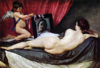
Sorry that I missed the posting for yesterday. School had my whole day taken up. But regardless, today’s pciture will be The Rokeby Venus. I really love this painting, the pose of the reclining female, the relaxed, almost uninterested facial expression in the mirror and the lovely skin tones. But I sat back and really looked at this painting and wondered what the one thing that really stuck out to me about this image. The thing I came up with is the fabrics. It reminded me of something Rebecca Guay (professional fantasy illustrator) told while while studying with her. When critiquing one of my personal pieces, she stressed the importance of fabric. Fabric needs to look like fabric. Fabric needs to show folds and creases and all the characteristics of fabric. Looking at the fabric in this piece, it almost has a life of its own. The sheen on the folds and the combination of subtle colors gradients and unsaturated light areas really show a great understanding of how light renders material. In addition, the ribbon on the mirror (another material), as it sits draped over the cherub’s wrists and mirror frame reflect the colors of the curtain in one area and the woman’s skintones in others. One thing to note is that is shows no reflection in the mirror (just an observation).

So, ultimately, in addition to the overall draw of the imagery in the piece, it has shown me how much attention needs to be paid to fabric.