Category: Uncategorized

Jeff Jones
Petar Meseldzija
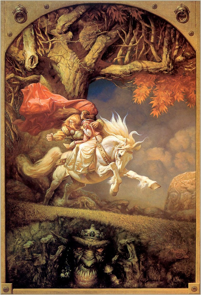
 If you are into fantasy art, I have no doubt that you are familiar with PetarMeseldzija and his Steel Bashaw painting series. They have been feature in at least the last few Spectrum annuals. This is the 9th one in his series and has an awful lot of things to talk about contained in it. Petar seems to use a trompe l’oiel framework in a number of his paintings which to me adds a definite fairytale quality to the presentation of the image. As I sit here looking at this image, I think to myself “I really love his horses.” THis horse looks as if it is ready to jump right off the page onto my desk. Its mane and tail are flowing, head down, legs out stretched. The amount of movement captured here is uncanny. The angle of the horses body lines up with the angle of the ground below creating and arrow head that points to the left and back to the imminent threat which draws Steel’s gaze. The tree is amazingly organic, with branches that contain what appear to be eyes, snake heads and claws (at least in my imagination). Petar has an amazing ability to render fabric as well, the cape the dress flowing in the wind, bending, twisting, curving. His neutralized clouds push nicely into the background help his horse to push forward for that jumping off the page feeling I just mentioned. His colors are saturate, yet not so much as to be un-lifelike, or unreal. And if that wasn’t enough, we have a scare orc, ogre, morlock to threaten us from a different direction adding yet more complexity and interest to this piece. I highly recommend visiting Petar’s website as the rest of his work is just as striking.

Brom
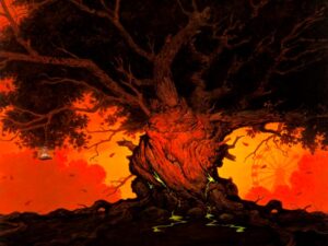 Brom. What a great name. I always wanted a name that didn’t distract you by having one before it or tagging along afterwards, like Brom…or Cher. Maybe not Cher. I had the pleasure of meeting Gerald Brom at Illuxcon 2009, and if you are familiar with his art, you might be surprised at the man behind the art. He is very meek, courteous and pleasant even though his work often takes on a dark, sinister, or grotesque form. In looking through Brom’s work trying to find a piece to review, one jumped out at me that superficially is slightly different than what you expect, that being men and women in bondage looking attire, people with eyeballs in their hands, or creepy looking dolls, mannequins, etc. This? It’s a tree. I think my friend and fellow artist Steve Anderson would love this tree with its gnarled branches, twisted trunk and dark canopy of leaves. This piece has a similar characteristic as Glen Orbik’s painting from the last post in that the background is basically totally in silhouette. There isn’t a lot of detail and the value contrast is much lower than the foreground. When you look at the background, you see a Ferris wheel, a happy go lucky Ferris wheel that any child would enjoy. But here is where Brom puts his take on things, because a Ferris wheel elicits images of a carnival and frankly, carnivals are creepy. Plus it is drenched in reds and yellows, the colors intense as fire. What is going on back at that carnival? We aren’t sure, but that redness throws up a caution flag to the viewer’s psyche. But let’s get back to tree itself. Sure it is knobby and gnarled, dark and twisty (much like Brom’s inner person or at least the part of him that he projects with his art), but that isn’t what draws my attention to this form. The thing that draws me in…is the cage hanging from the branch. Why? It reminds me of a quote from Richard Schmid. When he was painting a landscape with a barn, he asked “So what is that in the window of the barn?” And his answer? “I don’t know, but isn’t it lovely?” Take a look at that cage. What is in that cage? The answer? I don’t know but it’s it lovely? That little piece starts my mind to thinking, what IS in the cage? How did the cage get there? What relationship does it have to the carnival with its stark white color against that fiery red? Isn’t it lovely indeed…

Glen Orbik
 Earlier in the week, I had mentioned Glen Orbik. I find it appropriate to take a look at one of his images since his name is fresh in everyone’s minds (or at least in the minds of the people that read the Lipking post). As I flip through my Spectrums, I come across a few artists whose style makes me think, “I really would like to paint like that.” Glen Orbik is one of those artists. Having an oeuvre comprising of monsters, aliens, noir, pulp, vikings, etc, Orbiks work interests me. Plus, as we have discussed this week, his work is filled with painterly brush strokes. This piece has a number of interesteding qualities to it that are work noting. For one, the background is made up of very flat, neutral color shapes. They almost appear as cardboard cutouts, but what I think Mr. Orbik was going for was to create a stark contrast between the backup and the horseman. With the high contrast, high detail saturated color, the foreground horseman pushed significantly more forward than the flattened, more neutral background. Looking again at brush strokes, we can see the soft-edged blur effect of the strokes in the tail, the hooves, the flying dirt mounds and parts of the cape. Not much more to say on this one. It has been a rough week…

