Category: Uncategorized

John Singer Sargent

I do apologize if my last post was a little sparce. The point of this exercise was for me to try to learn something about the paintings I like so that I may be able to use those characteristics to make my own work better. I simply statement that a painting has a characteristic isn’t as useful as it could be. So, for today’s work, I will be reviewing “Villa Torre Galli The Loggia”. I believe that the first time I saw this piece was in Washington DC (I could be wrong). What catch me attention was the warm “airy” feeling that this painting conveyed. So it made me wonder why that feeling was being expressed so powerfully. Upon further review, I have noticed that Sargent decided to use a warm light, warm shadow approach to this piece. Even though there are areas in shadow, those shadows tend to be hints of burnt umber and burnt siennas as well as yellow ochres and warm purples. These color choices project a feeling as though sunlight is illuminating even the shadowy corners and depths that might be located in this view. Using only small bits of cooler greens and browns strategically, Sargent has provided a warm, inviting view of this relaxing courtyard scene.

I will need to think in the future about the feeling I wish to convey and whether color temperature of lights AND shadows can help me achieve it.

Artemesia Gentileschi

Today’s painting is Judith by Artemesia. For those of you not familiar, Artemesia was one of the few female old master painters, a contemporary of Carravaggio and a great user of what I wish to talk about today, chiaroscuro. This painting is a fantastic example of the expert use of chiaroscuro (extreme light and dark) in order to express a high dramatic feeling. The dark background is contrasted by the pasty white skin of Judith and her cohert. These dark darks also lends itself to the use of lost edges, for example, the edge of the yellow dress in the foreground, as well as Judith’s arm and sword. The limited palette used her also helps to be augmented by this high contrast drama. I will discuss chiaroscuro more in future paintings, but I just wanted to introduce the concept and this exceptional painter to you.

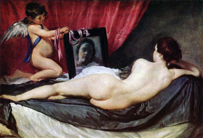
Diego Velazquez

Sorry that I missed the posting for yesterday. School had my whole day taken up. But regardless, today’s pciture will be The Rokeby Venus. I really love this painting, the pose of the reclining female, the relaxed, almost uninterested facial expression in the mirror and the lovely skin tones. But I sat back and really looked at this painting and wondered what the one thing that really stuck out to me about this image. The thing I came up with is the fabrics. It reminded me of something Rebecca Guay (professional fantasy illustrator) told while while studying with her. When critiquing one of my personal pieces, she stressed the importance of fabric. Fabric needs to look like fabric. Fabric needs to show folds and creases and all the characteristics of fabric. Looking at the fabric in this piece, it almost has a life of its own. The sheen on the folds and the combination of subtle colors gradients and unsaturated light areas really show a great understanding of how light renders material. In addition, the ribbon on the mirror (another material), as it sits draped over the cherub’s wrists and mirror frame reflect the colors of the curtain in one area and the woman’s skintones in others. One thing to note is that is shows no reflection in the mirror (just an observation).

So, ultimately, in addition to the overall draw of the imagery in the piece, it has shown me how much attention needs to be paid to fabric.

Jean Leon Gerome

I decide today to take a step backwards into history for the days painting to analyze. I have chosen Pollice Verso from Jean Leon Gerome in keeping with the illustrative narture of yesterday’s piece. This is a 19th century painting with a subject matter of a Roman glatitorial battle. An interesting note of this piece is that it is one the defining illustrations of Roman gladitorial games for the modern era in that movies such as Gladiator had their imagery based on this (and other) images. The modern view of the thumbs up or thumbs down at the end of a battle came from this piece as those particular head gestures were not used in this forum according to historical scholars. Anyway, on to the art.

I would like to discuss the concepts of lead-in and movement in relation to this painting as it has some very strong indications to these topics. When viewing this piece as a whole one notices that the most saturated color in the piece is the bright red flag directly behind the gladiator’s head. This color immediately grabs your attention and leads you to focus on the main figure. I also notice a second lead-in which come from the right side, starts at the figures in white and leads the eye along the other white hooded figures, along the railing to the red flag which inevitably brings you to the main figure. Once at the main figure the eye is led through the image, along his arm, down his sword, then across the body of the vanquished warrior, across his arm, up to the crowd and along the railings and architectural lines and back to the gladiator. This directed movement of the piece allows the viewer to observe all of the detail occuring in the painting and help them to move on and again until the entire image has been viewed. This is something that was taught where I go to school, but is often overlooked by students (including me).

The strong lead-in and movement lines in this image are noteworthy and hopefully can provide me a good example for my own future pieces.

Donato Giancola


Donato Giancola is a contemporary illustrator who current has his studio in New York City. I ahd not become aware of Donato’s work until last summer when I had the opportunity to study with him during a week long workshop. I became an instant fan as he exhibited such a love for his craft, a technical ability that is noteworthy and he was genuinely a really nice guy. So for today’s art analysis, I will be looking at his work “Lord of the Rings” which was used as a book cover for the JRR Tolkien novel. On Donato’s site (www.donatoart.com), he has a progression of this work and I hope that I am not using his images inappropriately in this forum, but just for sake of legality, all these images are copyrighted to Donato. If I am using them inappropriately in this “academic” setting, please let me know.
I have included the progression images so that I ccould discuss how positive and negative shapes, values and horizon lines are an integral part of the success of this image. The first thumbnail shows how Donato established separate sections of the picture plane by massing in a large dark shape on the right side of the image. He used a lighter value in the upper left corner of the painting in order to balance the “weight” of this large mass as well as added a high value area inside it to further balance the weight of this mass. In this first thumb, he has established a triangular composition in the center of the picture plane. I believe that he may have felt there was too much left-ward moving action in the first thumb and as you move to the second image, he has inverted the triangular compostion giving the figures a more stable, less energetic feel. And at this point, he has decided to tilt the horizon line to add a balancing instability in the background opposing the stability of the foreground figures. He does maintain the higher value area inside the large dark mass and has decided that this is the focal point. He further establishes the focal point of the image by in the color sketch by increasing the saturation of the high value area on the right and desaturating the similarly high value at the left, but also adds some more midrange value areas to the Gandalf figure and the wall. The final image esquisitely draws you into it, leading your eye to Frodo’s one ring using high key and saturated value, leads you through the surrounding area down to the lower sword and like Hopper’s image from yesterday, the application of similar color and value in the sword at the upper left draws your eye across the image unifying the image.
This is one of my favorite Donato pieces and truly appreciate his use of value and positive/negative space in this image.