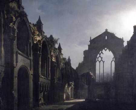
Category: Uncategorized
Frederic Remington
Here is a piece from illustrator Frederic Remington. I chose this image as it is a great example of my current study of how light and color temperature affect an image, it’s mood and its feel. Here we have two native Americans on horseback. It appears to be winter at night. Remington however made the decision to use a warm lighting and warm shadow composition which nearly entirely negates the expected feel of winter at night. This landscape is warm and inviting, expansive and displays no hints of foreboding, danger or conflict. The purples of the shadows and the sky in conjunction with the reds of the horses and background mountains envelops the viewer in an inviting scene that regardless of the weather and isolated locale, you want to enter in and explore. For my own piece of mind, I tested this asertion and put the image in photoshop and applied color curves that cooled the shadows and sky with a bluish hue rather than red violet. The effect was obvious in that the snow became cold. The atmosphere became uninviting and the feel was bleeker. This all by doing nothing but cooling the image down. I am beginning to see a pattern: Cool light and cool shadows yields a dreary and bleak feel. Warm lights and warm shadows yields a hopeful, inviting and comfortable feel. I am expecting then that a mixture of either cool lights and warm shadows or warm lights and cool shadows will yield specific feels in a work. The next few images I post will explore that.
Aaron Miller
I asked Aaron months ago if I could analyze a piece of his and he told me yes. Then I proceeded to stop posting. Sorry Aaron. Now that I have picked back up on this, it is time to get Aaron in here. However, I have decided to look at his Agents of Artifice contest, third place winning piece as considering I am currently focusing on lighting, this is far more complex than the other piece I was looking at. (Congratulations again Aaron, BTW) Aaron has some wild lighting going on in this piece. He has multiple light sources going on here, reflected lights, deep shadows and highlights all occuring in night time atmospheric darkness. The major light source appears to be the monster’s eye, casting a yellow hue on the angel wings and the monster’s hands/fingers. Interestingly, the yellow light appears to be on the opposite site of the left hand fingers than it should be considering the poistion of the light source, yet the illumination on the area is convincing and doesn’t look out of place. The green ooze is emitting a yellow/green light which is providing rim light for the left arm and the spear head as well as adding some reflected light into the shadows of the back of the head and tinting the hightlights on the teeth. There are cool blue rim lights on the monster’s right hand and some on the teeth, some on her legs and a touch on the back yet none of this light is reaching the edge of the angel’s wings. There is a bright highlight on her chest and on the top of the monster’s head that like many Rembrandt paintings, doesn’t appear to come from anywhere, unless it is the spear head in which the reflected light from her chest and its head is actually brighter than the source. And this light seems to have no effect on the monster’s left arm. Yet it works. Moonlight highlights the rain drops as they fall, the red ooze adds warm reflected light into some of the lower shadow areas. At this point in my own painting, I cannot even conceive of trying to tackle a piece with lighting this complicated. Kudos to you and if you are reading Aaron and have anything to add, please chime in.
More Menzel
Staying in the vein of Adolph Menzel, I found this other piece which is similar in subject matter to the last one (statues in a studio), however, this one has a much different feel. Nearly all the tones in this pieces are cool. Cool greens, cool reds, cool browns and even cool whites. Darker values heighten the drama and the dramatic under lighting adds even more to this drama. As opposed to the light airy feel of the last piece, these cooler, darker tones feel constricting and heavy complimenting the eerie subject matter. There are but a few warmer tones in this piece and they surround the central torso helping to draw your attention there. I took this picture into photoshop and overlaid an orange layer over this image and adjusted so that it warmed all the tones, but didn’t change the hues (much). The result is striking. The eeriness is greatly depleted and it feels more like looking at items hanging over a warm fireplace. Again I say…interesting.
Adolph Menzel
Ok. It has been a while since I have posted on this analysis blog. I just spent a week at the Illustration Master Class for 2009 and I feel as if the things I learned last year, I put to use, mostly in the realm of compositional development. However, what I have learned is that I still have a ways to go in dealing with lighting color and temperature and how they help define forms and relations in space. So, I will now being choosing illustrations from history (inspired by Charles Vess and his history of illustration presentation). Today is a piece by Adolph Menzel. In this piece, Menzel chooses what I deem a simple light source/color temperature schema. He has his lights coming directly from the right, illuminating all the forms in the room. The lights are warm in yellows and reds and the shadows appear cool in blues and raw umbers. However, the more I stare at it, the less sure of my assessment I am. So I take the piece into MS Paint and run the color selector over areas of the painting and what I find is that the areas I thought were cool shadows appear to be created with warm tones. The purples are on the reddish side rather than the bluish side. The umbers are more burnt than raw and the shadows on the golden object are ochres. I believe that the color difference is coming from relative local temperature in that the shadows appear cooler in relation to the warmer highlights, but taken by themselves are still on the warm end of the scale. I think Menzel may have done this to create an open and airy feeling in this large room, whereas cooler shadows may have made it more dramatic. Interesting…