Category: Uncategorized

Gustave Caillebotte

He was a French Impressionist. The name of this piece is Le pont de l’Europe. I have done some studying of the French Impressionist, the movement, the historical context of the art and the artists living in that period and have chosen Gustave Caillebotte today, not because he was known to me, but rather because he was relatively unknown to me. His style was lsightly more realistic than his counterparts like Monet and Renoir. From what I have quickly researched, Caillebotte had interests in photography and this possibly influenced his style more than the other in the movement. This piece is a genre piece which reminds me a bit of the works of Norman Rockwell and depicts a dog and people on the street going about their business. The points of interest in this piece for me are the use of one point perspective and the repeating geometric pattern created by the bridge rafters and railings. Another point of note is the use of purple shadows which was commonly used by the Impressionist painters. Some Impressionists also used straight black on their palette which seems to be an ongoing debate as to whether to use black or not, but my guess would be that the darks of the walking couple’s clothing were actually created with black rather than a neutralized dark value mixture.

Would I hang this piece on my wall? No. But it is a strong example of the shift from romanticized narrative images to that of creating images of everyday life during this period.

John Banovich

So, I have been spending time analyzing artworks from the last 30 centuries, trying to get a good mix from contemporary and classical artists. My interests are generally naturalistic or realistic rather than abstract. I am a fan of most styles of realism which may actually embody 90-95% of the art throughout history. My hope is that anyone reading this blog would agree that I am displaying a good mix and variety, but feel free to tell me otherwise.
Today, I would like to return to the present and take a look at a piece call “Eye of the Raven” by contemporary animal painter John Banovich. I first saw Mr. Banovich’s work in the Artist’s Magazine and actually fell in love with this painting. I never really thought about why, so now I am going to take the time to try to determine why. Obviously this is a simple subject, a raven on a branch. Nothing flashy about the pose or positioning, yet still, John’s treatment of the subject is attractive and compelling to me. He seems to have used a classical portrait approach to the lighting, having a 3/4 front lit approach. Nothing too innovative there either. Yet it is compelling to me. As I look at the background, I see large and energetic brush strokes, daubing greens and ochres, siennas and umbers; I determine the color palette is in line with my aesthetic tastes. One reason for it to be compelling. On to the treatment of the raven itself. It is more refined than the treatment of the background. That sets up some contrast, wild and energetic background to more defined and stoic foreground subject. That is compelling. The color palette chosen for the raven is intriguing, with the prussian blue perhaps midtones and starker cool white highlights. Each feather is render as if they were painted individually and place into this painting. Variation in feather texture, size, and direction are all skillfully composed. There is also a warm reflected light hitting the belly of this bird, helping to define its volume in space. Lost edges on the tail feathers with sharper edges on the head and beak help to bring the focus on face of this animal, facial focus being crucial to many good portraits. It would seem that all of these items working together take this piece from mundane to exciting.

John Atkinson Grimshaw

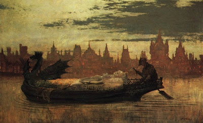
Elaine is the name of this piece. I could only image that this is the name of the dead girl in the boat. This image could be portraying the ferryman who shuttles the dead across the river to the underworld, but I do not know for certain. What I do know is that this piece has a bold sense of mood. It’s dark shadowy silouettes of the boatman and the boat are in sharp contrast to the distant city skyline. The buildings have a warm glow to them, indicating the warmth of the living, whereas the cool tones of the death are at the forefront. I had done a painting personally where I was required to make the warmth of a fire recede into the backup and keep cooler tones push forward and it was indeed a daunting task, yet, Grimshaw has achieved this task masterfully. A relatively simply image in composition and form, the mood that is created here is indeed intriguing.

John William Waterhouse

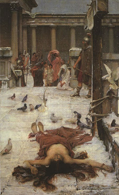
This image from Waterhouse illustrates the story of “St. Eulalia”. Not being familiar with this story, I googled it and apparently it is the story of a young virgin who was beat, tortured and eventually crucified for not renouncing Christianity. As the story goes, she was finally decapitated and a dove fly from her neck. Analyzing Waterhouse’s treatment of the central figure, it is obvious that he did not intend to illustrate the horror of this girl’s tribulations, but rather decided to depict the “aloneness” of her situation. You see the girl centrally located in the foreground, surrounded by a mass of white which brings your attention to her, yet all the other figures in the piece are removed from her, being either held at bay by the roman guards or having the guards themselves disregarding this site. Doves has been added as details being the only living things sharing her space in the frame. I also noticed the positioning of her legs which seemed odd to me at first. I think this was done for two reasons. One, if they were postioned straight, a symmetry would have been create which creates more stability and less drama. Also, having her feet point towards the people would have connected her to them and diminish the the feeling of solitariness. Therefore, I have learned from this picture that figure positioning itself can be used as a tool to create drama.

Joseph Mallord William Turner

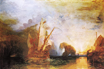
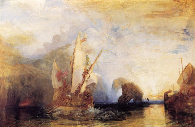
Turner. What can I say about Turner? If you have ever stood in front of an original Turner, you will understand. I have had the please of seeing the Burning of Parliament in the Philadelphia museum of Art. It was huge, 8 feet by 6 feet perhaps. The paint was so thick in spots that it was almost hard to image how he was able to manipulate that much paint and still have it flow the way he wished. So then, I upgraded my Dish Network to HD and got free HD channels for a month. There was an HD Art channel and I was exposed to an hour long program of Turner art on my widescreen in HD. Unbelievable. I was a fan. What I learned from that TV program was the extend of the body of work or Turner that I was unfamiliar with. So in searching, I came across this painting today. It is called “Ulysses Deriding Polyphemus – Homer’s Odyssey”. I found two versions of this image and not having seen it in person, it is hard to know what the original looks like. However, based on my Philadelphia experience, I would tend to believe that the first image is more accurate. The colors and vibrancy of the Burning of Parliament seem to be mirrored more closely in the top image. It also teaches me that the images found on the internet cannot be trusted for accuracy in color or intensity, so I am grateful that I have seen an original Turner for comparison. The thing that attracted me to this particular image, I believe is that it has a certain illustrative quality to it due to the boat details and the vibrancy of the colors. I brings to mind my childhood and watching Fox’s Peter Pan and the Pirates on TV. It evokes those memories for me. Turner has a nearly unparalleled ability to create an illusion of light in his works. He is able to generate a huge amount of warmth in the wood, sails of the ships and reflections on the water and then contrasts that warmth with the coolness of his clouds, water and rocks. My recommendation is that everyone should spend more time studying Turner, especially in person.