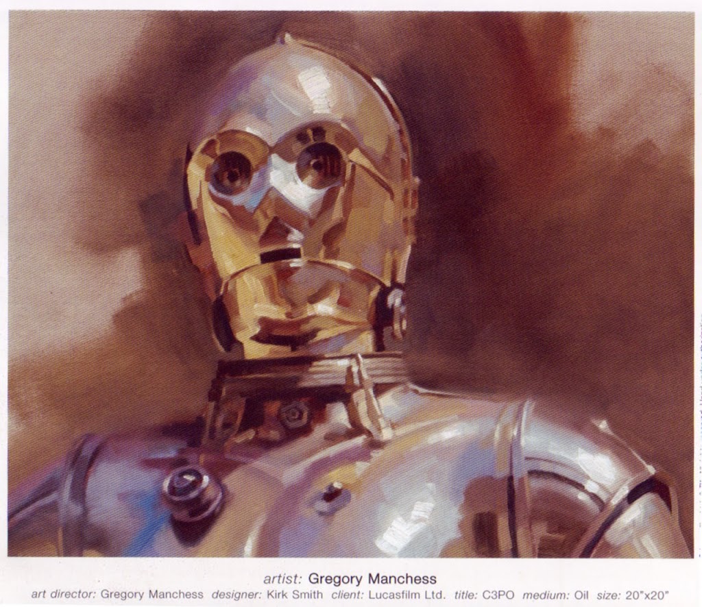
 Hello all. The Constant Art Student returns from more months of slacking. I can’t say that I have been art slacking as much as blog slacking. I have been drawing and painting with most of my spare time, but I feel compelled to make a comment on a painting from Greg Manchess that I have been studying. My latest endeavor has been to make a conscious effort to loosen up my drawing and painting style. Since Greg is one of my favorite artists with this looser painting style, I decided that analyzing his work as I would an old master painting would be beneficial to my cause. Spectrum 16 came out this year and had this wonderful portrait painting of C3PO from Star Wars. Big, bold brush strokes could be seen in the repoduction, so I thought that it would be a great place to start. What a deceivingly simply looking painting this is. Forgive the lack luster reproduction of the image I have posted here. I am sure that it pales in comparison to the original, however, a number of points of note can made using this version. To give some background on how I proceeded with studying this painting, I placed a sheet of acetate over the image and mixed paints to color match what Greg was using (or what I percieved he was using) to get the colors here. What I found rather astounded me. Colors that I thought were right out of the tube such as yellow ochre or naples yellow were not that simple when viewed directly over top of the original. The main areas of color that are in the midtone range are a combination of yellow ochre AND either raw unmber or burnt umber. Wheras Greg most likely used Old Holland Violet Grey for the light areas, I was able to make this color by mixing Ultramarine blue and cadmium orange with white. Ultramarine blue, napthol red, alizarin crimson and combinations of white or umbers fill the shadows. Once I found how to make these color mixtures, I started to realize the temperature shift that Greg employees in this piece. Shiny metal is difficult to begin with, but Greg has simplified the process by using a basic cool light, warm shadow composition. You can see the cool blues and greys in the light areas and this temperature pattern is reinforced by what I saw in the choice of raw versus burnt umber usage. The cool lights on the eye indentations (for examples) are reflected into the warm shadow areas directly across the socket. On another front, I also noticed Greg’s expert use of soft and lost edges on the forehead of the droid and well as his left and right shoulders. Considering what I have learned from this “simple” painting, I am glad I didn’t start with one of his mutliple figure Conan pieces.