Author: markharchar

More Menzel


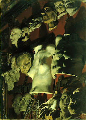
Staying in the vein of Adolph Menzel, I found this other piece which is similar in subject matter to the last one (statues in a studio), however, this one has a much different feel. Nearly all the tones in this pieces are cool. Cool greens, cool reds, cool browns and even cool whites. Darker values heighten the drama and the dramatic under lighting adds even more to this drama. As opposed to the light airy feel of the last piece, these cooler, darker tones feel constricting and heavy complimenting the eerie subject matter. There are but a few warmer tones in this piece and they surround the central torso helping to draw your attention there. I took this picture into photoshop and overlaid an orange layer over this image and adjusted so that it warmed all the tones, but didn’t change the hues (much). The result is striking. The eeriness is greatly depleted and it feels more like looking at items hanging over a warm fireplace. Again I say…interesting.

Adolph Menzel

Ok. It has been a while since I have posted on this analysis blog. I just spent a week at the Illustration Master Class for 2009 and I feel as if the things I learned last year, I put to use, mostly in the realm of compositional development. However, what I have learned is that I still have a ways to go in dealing with lighting color and temperature and how they help define forms and relations in space. So, I will now being choosing illustrations from history (inspired by Charles Vess and his history of illustration presentation). Today is a piece by Adolph Menzel. In this piece, Menzel chooses what I deem a simple light source/color temperature schema. He has his lights coming directly from the right, illuminating all the forms in the room. The lights are warm in yellows and reds and the shadows appear cool in blues and raw umbers. However, the more I stare at it, the less sure of my assessment I am. So I take the piece into MS Paint and run the color selector over areas of the painting and what I find is that the areas I thought were cool shadows appear to be created with warm tones. The purples are on the reddish side rather than the bluish side. The umbers are more burnt than raw and the shadows on the golden object are ochres. I believe that the color difference is coming from relative local temperature in that the shadows appear cooler in relation to the warmer highlights, but taken by themselves are still on the warm end of the scale. I think Menzel may have done this to create an open and airy feeling in this large room, whereas cooler shadows may have made it more dramatic. Interesting…

Aelbert Cuyp

The Maas at Dordrecht. This is the type of painting that prompted me to start this blog. I like this painting, yet I am realy not sure why. It has a certain serenity to it. The horizon is perfectly horizontal. The sea is calm. The sails are not filled. The sky is a calming shade of blue and only depicts a hint that the weather will not remain pleasant. There are a large number fo ships reaching off into the distance. People are mulling about not doing anything obviously controversial, energetic or out of the ordinary. It simply depicts a quiet day at a sea port. I believe that the mood of the subject matter in this piece is what makes it attractive. One can rest and look at it with being rushed along. There is no sense of urgency and one can wander through it at a leisurely pace, setting the rest of the world aside and taking in the calm of a day near the shore.

Edgar Degas

Impressionism. Love it or hate it, it made it’s mark on art history. With Degas, ballerinas dominated a number of his works and even though the subject matter is not my cup of tea, this painting engages me on some level. If you were to remove the figure’s upper bodies, this would appear as a mere landscape based on color and shapes in the design. However, adding the figures affects our psyches and start us wondering how they relate to their environment. This painting seems to integrate the two subjects seemlessly. One thing that makes this piece pop for me is the dark contour lines of the figures. Making them seem almost graphic in nature, these back lines accentuate the contours and shadows and set the figures apart from their surrounding environment. Without them, they would most likely blend into the background and be lost in the barrage of colors and brush strokes. Where to use this technique? I for one will keep it in the back of my mind.

Louis Anquetin

For today’s image, I have decided to trace back my own art training history to see where it leads. My main painting instructor has been a man named Michael Molnar. Molnar was a student of Joseph Sheppard. Joseph Sheppard was a student of Jacques Maroger. This takes me back to the end of the 19th century. One more step back and I land at Louis Anquetin. Anquetin was a contempory and friend of Toulouse-Lautrec. This may not mean anything to anyone but I have a certain affection for the impressionists and this time period in art history and to be able to trace my teaching directly to that period is exciting for me. The piece I am looking at is called Clichy Avenue. When I look at this piece, I can definitely see similar characteristics to Toulouse-Lautrec and a resemblance to Van Gogh’s Starry Night over the Rhone. As I quickly researched, it seems this painting may have actually been an inspiration for Van Gogh’s work. The large areas of flat color was common at the time in history and brings to mind Lautrec as well as Gaugin and Cezanne. As I continue to come across, Anquetin uses a complimentary color scheme of blue and oranges balancing the weight of the orange hues with a smaller patch of red-orange in the lower right corner. Most of the figures in this work are abstracted with very few details. The focal point of the piece is the brightest yellow point located in and as the flame of the front lantern. The lantern is shaped as an arrow which leads the eye down to the ground level and into the crown of people. I have always been a fan of Van Gogh’s “Rhone” and considering the great similarity of it to this piece, I can appreciate this one as well, especially with the added historical link to my own studies. One word of note is that apparently, Anquetin gave up on this style of painting and instead persued a more academic style which was passed on to his students which is unfortunate as the style shown above as truly intriguing in its own right.